Table of contents

Why Read It
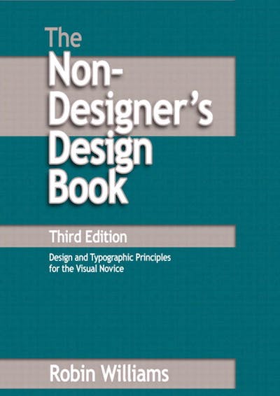
I started recently on a couple of web design books because I felt I needed to have more of a foundation on web design history to tie in with my online learning about UX and UI design. I hope that reading around the subject, especially on topics that were covered in this book helps me add depth to my knowledge and to round off my skills surrounding creative design decision-making.
It's an easy read, perfect for a commute and can be completed quickly (circa 190 pages of body copy.)
Where to Find It
This reference came up several times as I was searching what e-books to read. You can find a handy summary here and the pdf here.
It should be noted that the book is a general design guide for printed documents however, the best practice can be easily translated to websites.
Key Points for Me
My main takeaways were:
About alignment, try not to centre-align text or headings. It's an amateur move and one that any beginner will make (including me until I read this!). There is a concept of a hard line in the written word. Readers are more likely to read down the page intuitively if headings and subsequent close-proximity text are left or right-aligned (flush along a hard line) as both sets are aligned together. With the centre-aligned type, you get this jagged, comfortable, weak edge as your character length will vary, which is unappealing. This design effect is often seen in formal invitations like weddings. Interestingly, if you have to centre-align it, contrast it to make it stand out as strong contrast can have the effect of drawing the reader's attention.
Try to use the proximity of related content. This means intuitively combining content (reduce whitespace) that is contextual so that it is obvious to the reader that the sections or flow of the webpage is natural.
Use contrast as a precursor to a change in topic, theme or content. The book goes into detail with many examples of how to achieve this typically with typeface form, structure, weight, font styles, colour, spacing and size of elements etc. The emphasis is on difference, so for example use an extra bold font weight and contrast with a thin font, don't use medium or semi-bold.
Repetition is key. To enforce your branding or mission and leave the viewer with the memory of who you are or what you are offering, you need to repeat elements on your print or site. This could be key colours on your palette, or a specific text like a slogan or image like a logo.
It's worth taking stock of the author's breakdown of different typefaces and the history behind them as he explains it eloquently. You can find this in chapter 9 onwards about Type Design and categories of Type.
Before, I thought the different styles were just for aesthetics, and although they are for appearance's sake, different styles are meant for different purposes, whether that is informational, instructional, or decorative.
