


Table of contents
I have been mainly involved with webpage content build again, back and forth between the digital team and content provider, and getting input from additional teams on the best way to display the information. Other than that, there has been limited programming learning to speak of. I have been using the downtime to get through the CodeCademy front-end engineer path, and I'm on the modules about state management, libraries and tooling on top of React. I admit the lessons are not going smoothly as I haven't built up enough projects to confirm my understanding of the fundamentals yet, so with each of these new methods like React routing, Redux library etc., they act like more layers of abstraction to reduce the amount of code to write but what they are doing behind the scenes is still a mystery. I'm sure I'll return to it one day, but for now, I'd rather get through this path as it's been on my list of to-dos for a long time, and I want to move on to building projects and learning other core principles.
Container Queries
I've heard more about CSS container queries, and I'd like to see if it is a concept that can help with our project codebase responsive layout issues. As component-based design becomes more prevalent in modern web development, it could be a new way of thinking about localised RWD.
Instead of basing conditional styling on the viewport width, we change styles based on the available space for our component, depending on how much space is available for our component. We do this by querying the container based on width (inline size) or height (size). Of the few blogs I have read and videos, it seems that container-type: inline-size; is the most appropriate as you adjust styles based on container width, which is more likely to vary.
An example of implementation
Create the container on the parent wrapper with style property container-type: size or inline-size. Inline size means looking at the wrapper's width and applying styles to the children based on the width. It is likely the logical property that matches most use cases for responsive web design. The other property is ‘size’, which will adjust the children based on the container’s height. Usually, we don’t assign absolute heights, so there are fewer use cases for this property value.
This means that the children within the container will change styles dependent on the container width and not an absolute viewport width like when using media queries.
When you want to apply the styles, instead of
@media, replace with@container, e.g.@container (min-width: 700px) { .call-to-action > .btn { grid-column: 2 / 3; grid-row: 1 / 3; align-self: center; } }
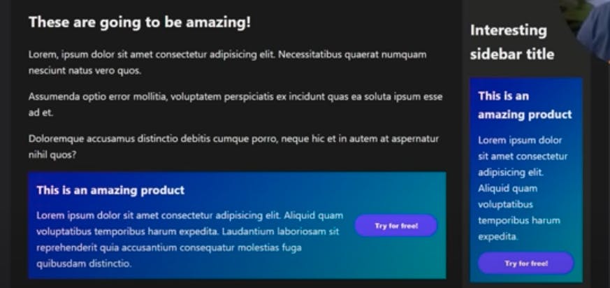
This is a screenshot from Kevin Powell’s ‘Container Queries are going to change how we make layouts’ Youtube Video For the sidebar, the container width is not 700px, so it stacks into a single column or uses normal flow. However, the container’s width for the main article is greater than 700px, so it snaps to a two-col layout. If we tried this with media queries and breakpoints, we would have to create additional class names to suit both designs at the same viewport width.
We are not restricted to min-width and max-width assignments. We could use width > 700px, less than symbol, less than or equal, etc. We can even put the logical property inside the @container function: @container (inline-size >= 700px) ~ making the syntax more concise and readable.
A bit of caution, when using container queries in combination with flexbox and grid, if you define additional nested containers on the flex or grid items, this throws out the layout algorithm implied by flex and grid where children define the width. Now, the items are basing their width on the parent and container query.
Debugging
In Chrome dev tools, when you have assigned a container, you can select the tag acting as a container and view its children much as you would for examining a flex layout or grid.
Summary
Container queries excel over media queries because modern web development is based on atomic design and component-based UI. We can still use media queries for ‘page’ layouts, but adjusting their styles based on the parent container is preferred to manage individual components. This should help us avoid the ‘no-mans’ land’ small range of viewport widths where the layout looks odd on mobile and tablet size, for instance. You would then have to prepare additional bespoke styles to handle the edge cases, adding more specific breakpoints to account for this small range.